1 Week Design Sprint
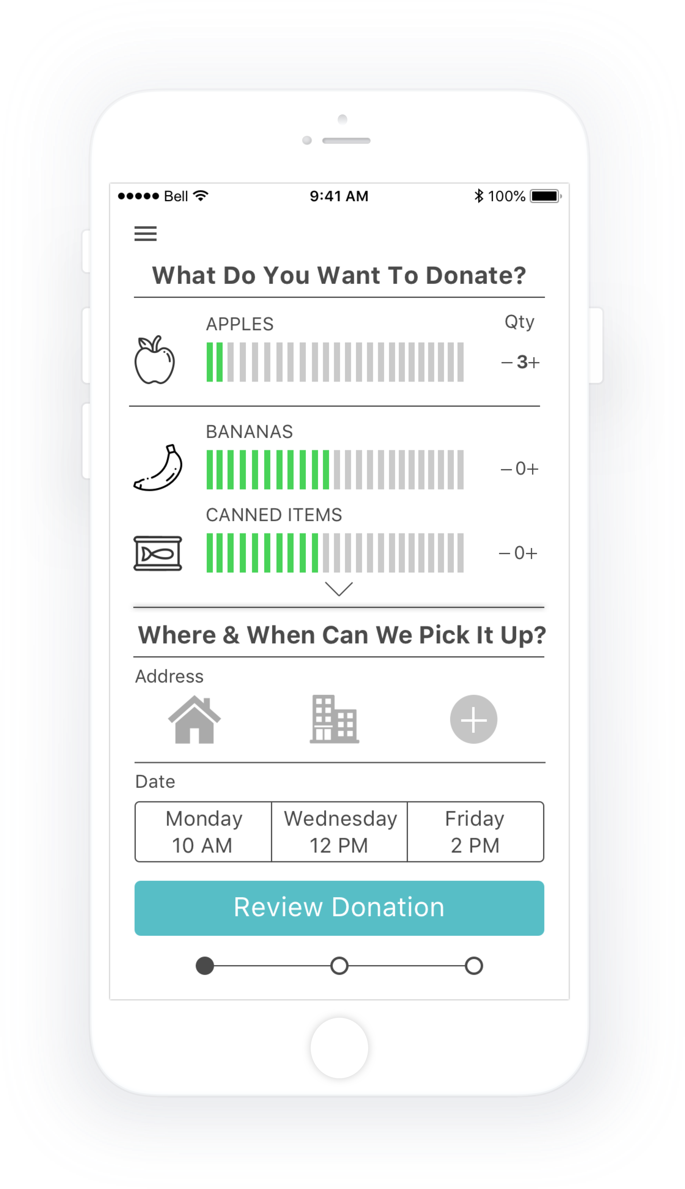
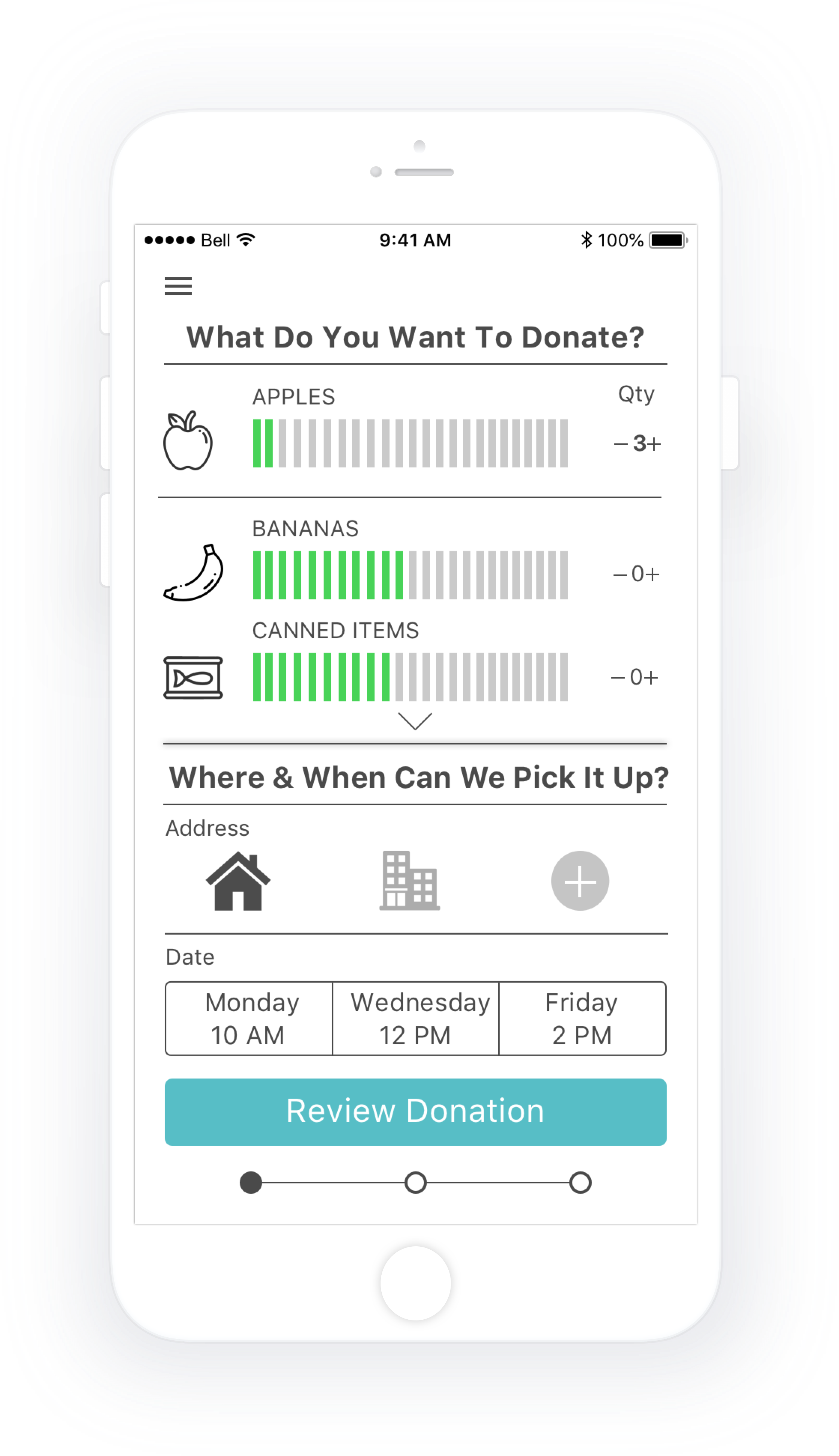
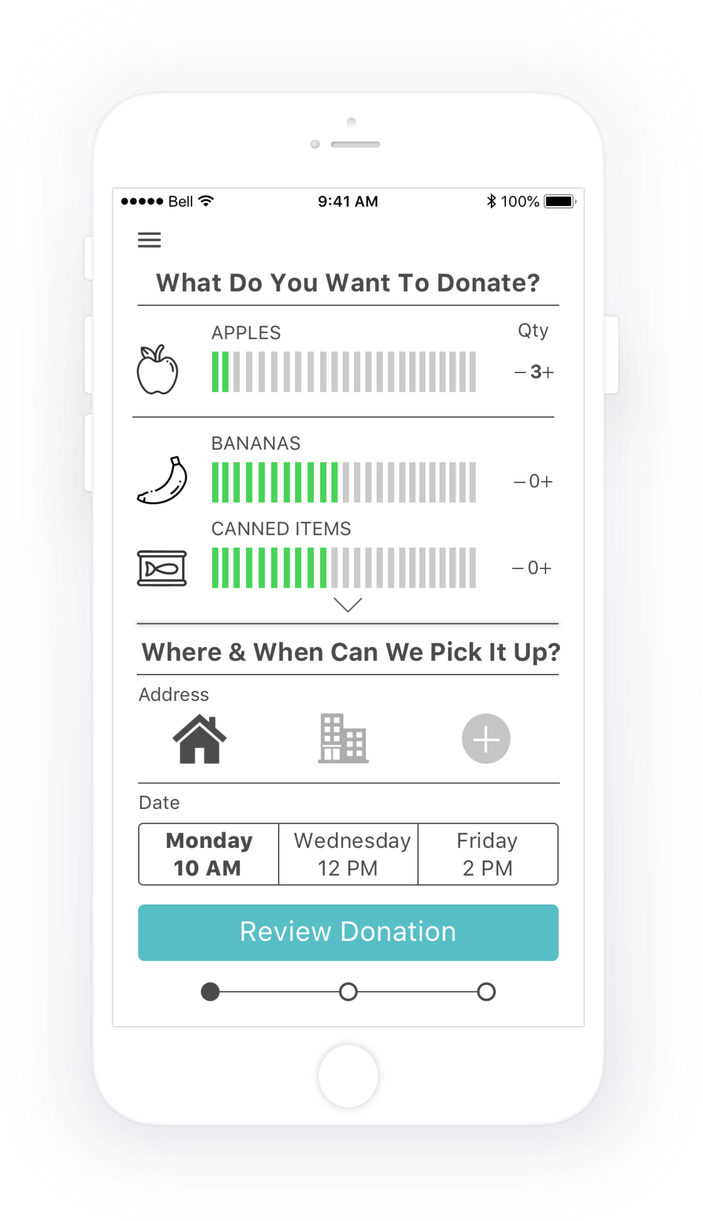
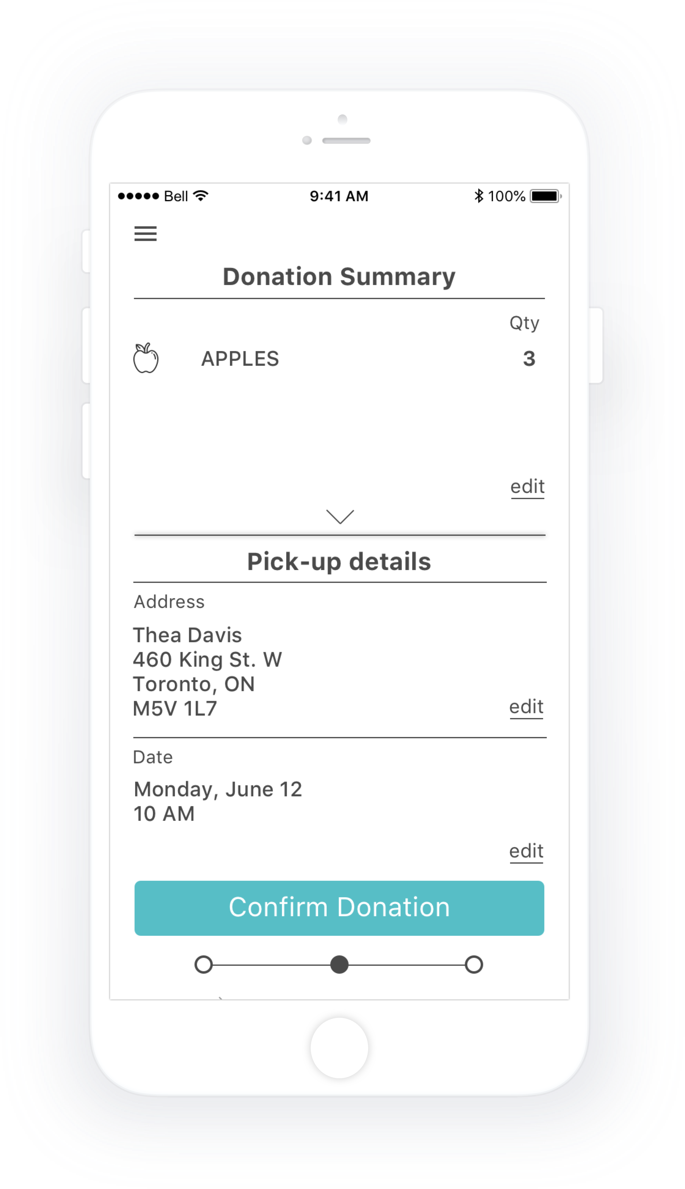
SURPLUS is a hi-fidelity iOS app prototype that tracks food freshness, and offers a way to make food donation easy with scheduled home and office pick-ups.
The End-To-End Process
START > 1. secondary research 2. inspiration gathering 3. brainstorming 4. proto-persona identification 5. HMW development 6. project planning + strategy 7. value proposition 8. business model canvas 9. hypothesis development 10. primary research 11. persona development 12. experience mapping 13. user stories 14. task flow analysis 15. sketching + ideation 16. grayscale wireframing 17. group design critique 18. hi-fi Sketch designs 19. prototyping 20. 2 rounds of user testing and iterations 21. team case study presentation
While grocery shopping, people often bought more food than they could eat.

People wanted to donate more without spending a lot more time or energy.

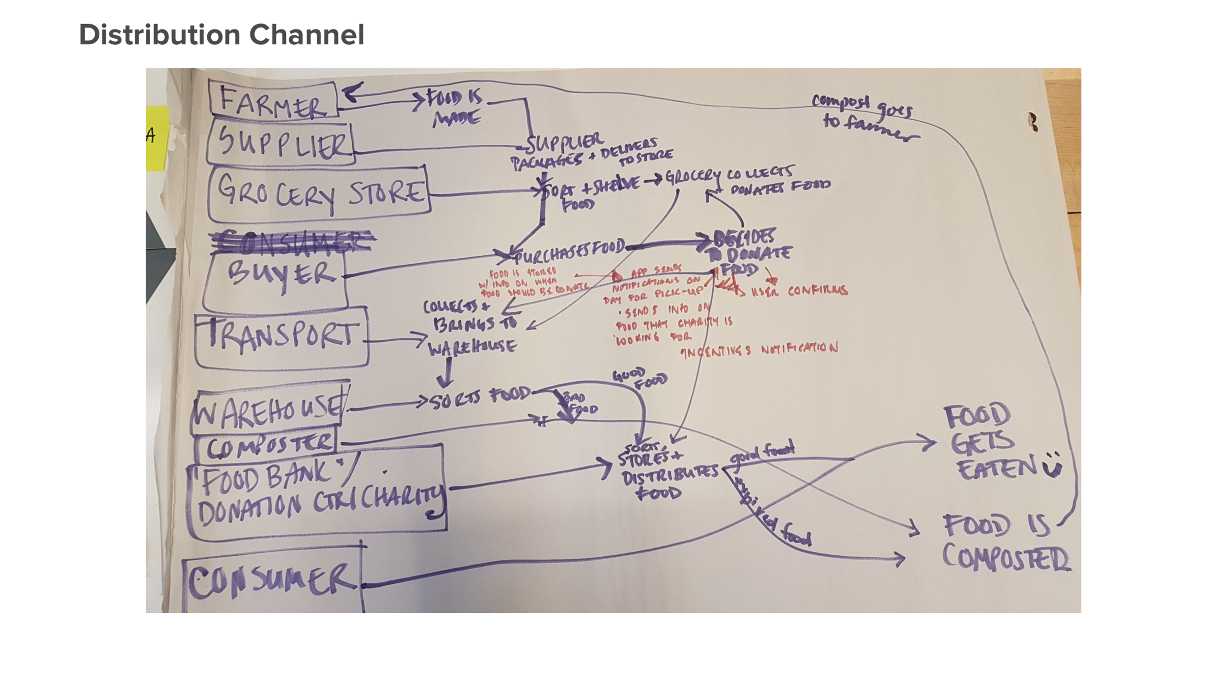
The challenge was to formulate an efficient distribution flow where 100% of donated food was utilized.
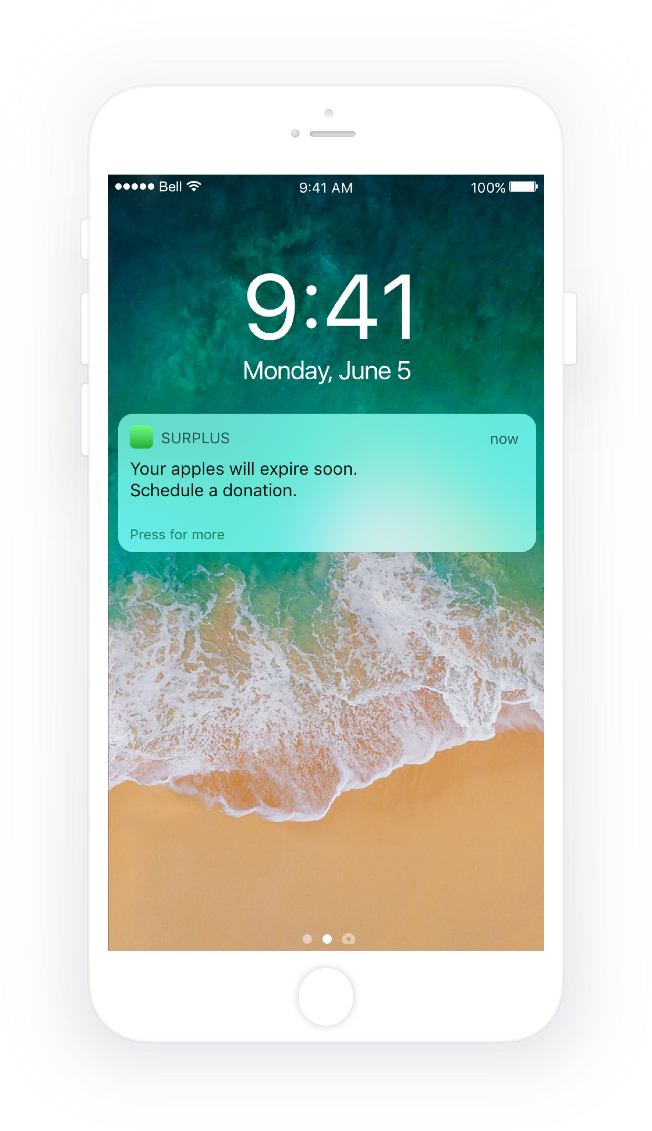
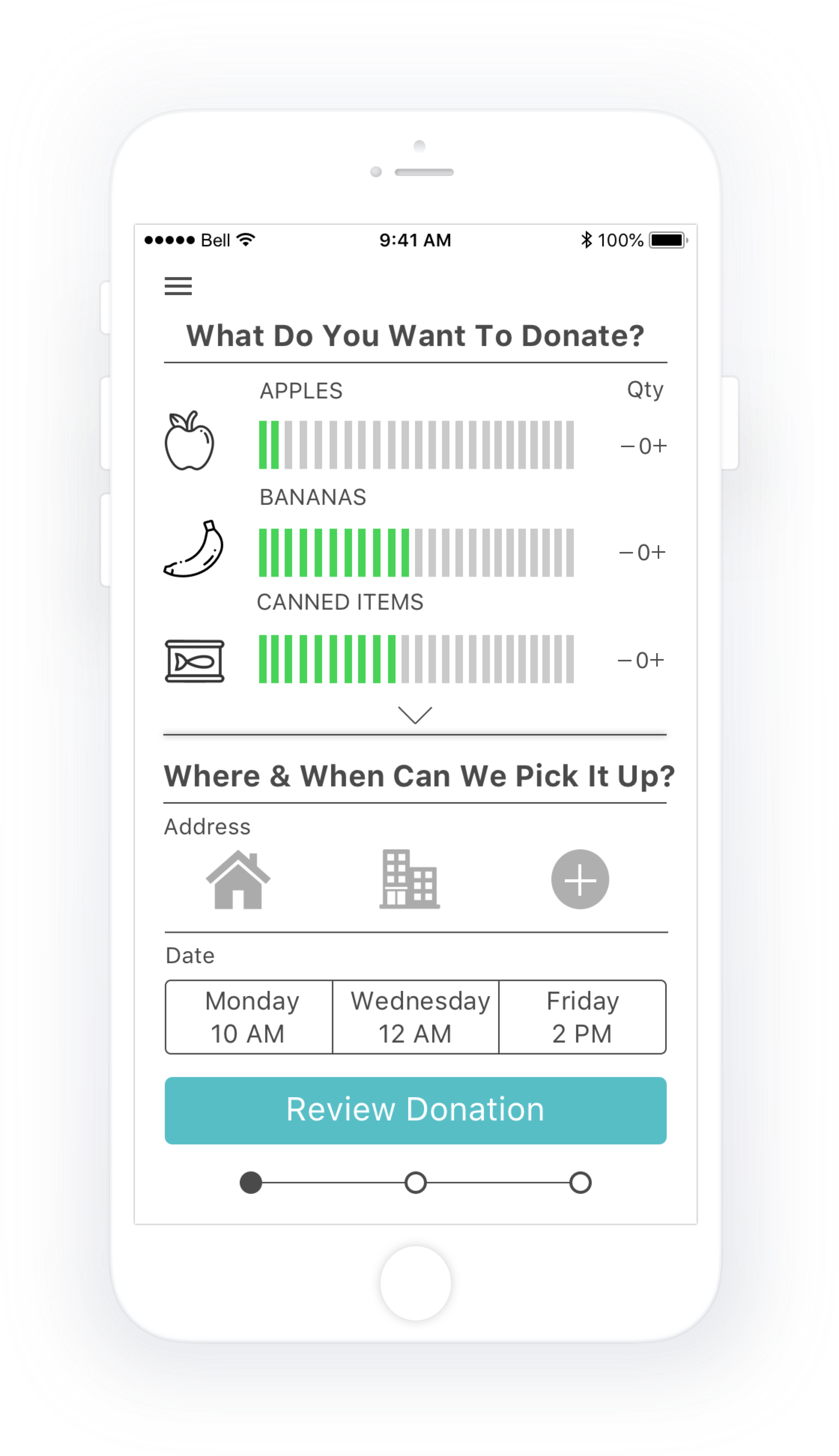
Provide consumers with an easy way to scan grocery receipts, receive notifications when food is about to expire, and schedule free food donation pick-ups.

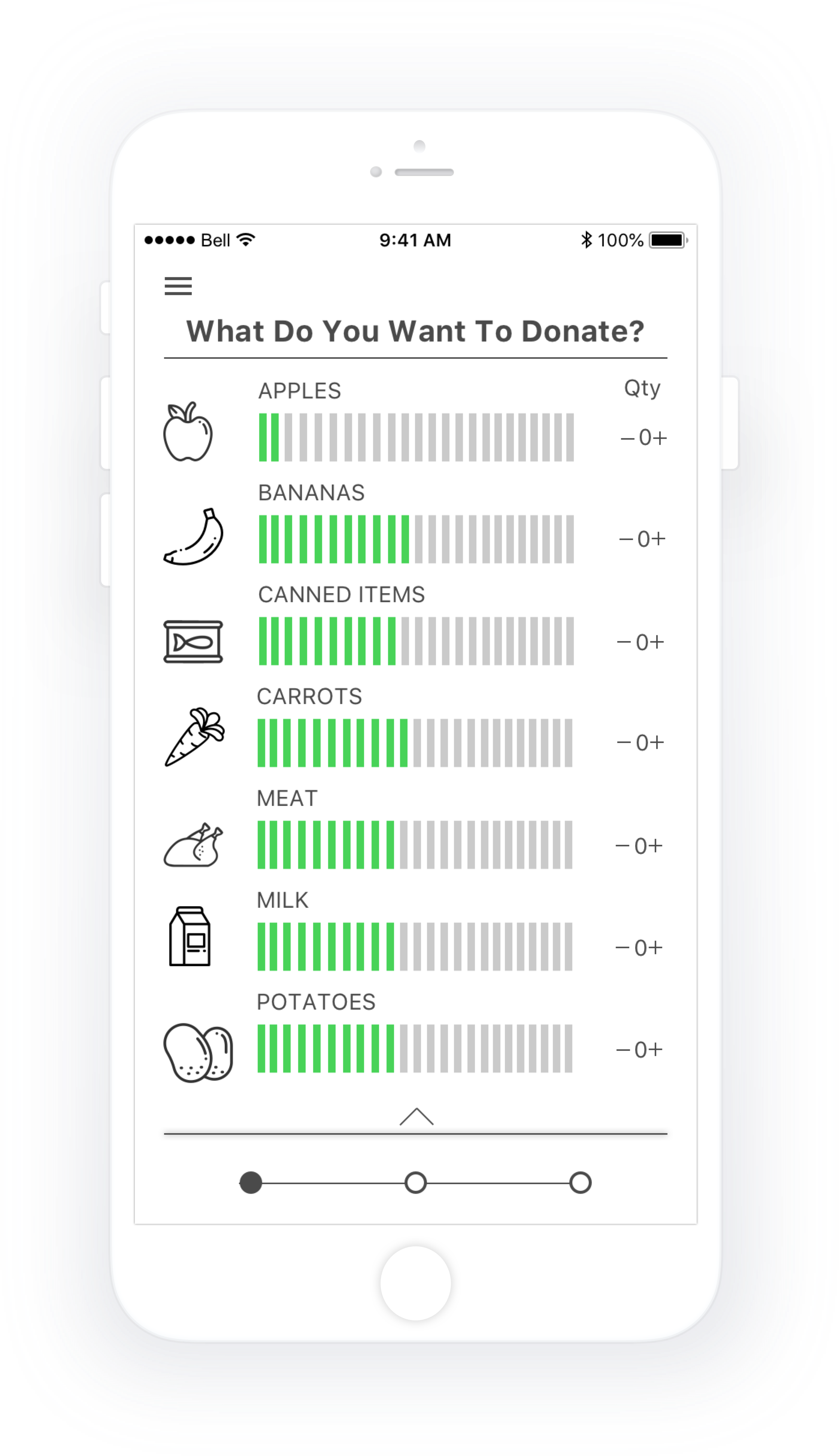
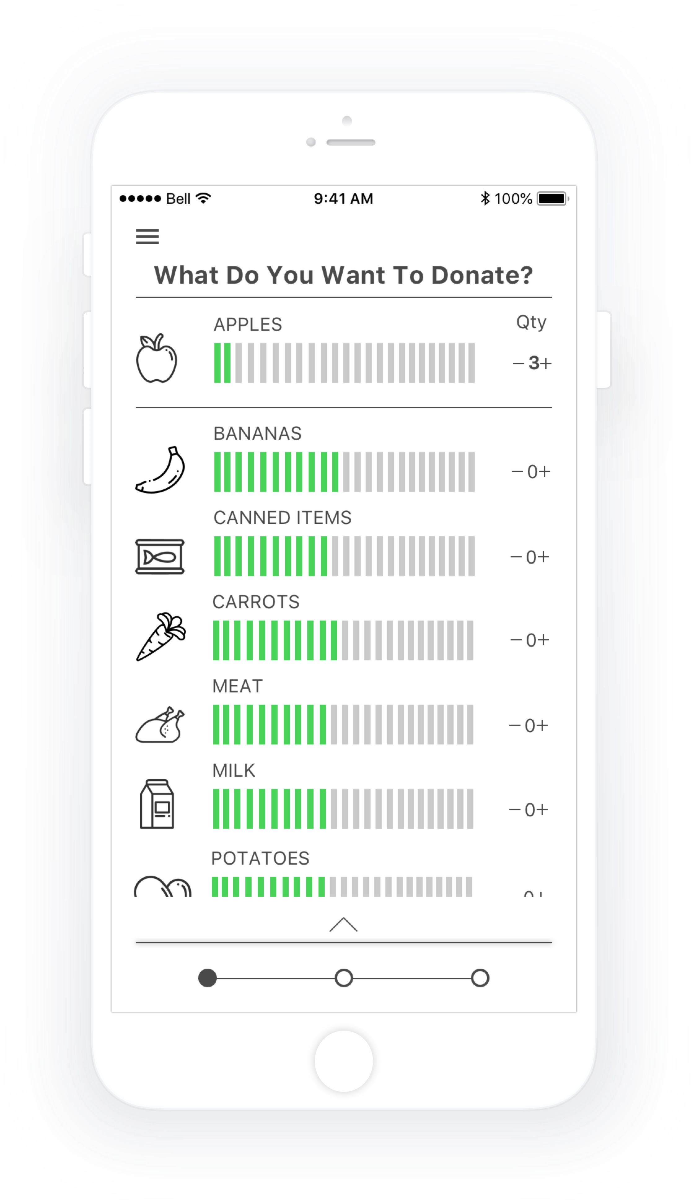
Scheduling a Donation Pick-up - Returning User Flow
Click on the image to check out the InVision prototype.

Click on an image to enlarge.
Project Overview
Name
SURPLUS
Year
2018
Duration
4 days
Platform
iOS: Human Interface Guidelines including a 10pt grid & SF Pro.
Team Members
Kristen Jones, Kaiva Brammanis, Thea Hao & Veejay Makwana
My Role
Participation in group ideation. The decider: making final decisions during the design sprint for our group. Asset collector: inspiration, typography, color & aesthetic.
Problem Space
Fifty percent of all food produced is wasted, while 47% of this food is wasted at home.
Constraints
Formulating an efficient distribution flow where 100% of donated food is utilized
Ensuring that the business model is sustainable
Challenges
All team members went into the 4 day sprint and design process green, thus making for an extremely steep learning curve
A desire to make an iOS native feeling app without a working knowledge of the Human Interface Guidelines
Assumptions
We assumed that a vast number of people would be willing or motivated to donate food, and through conducting primary research proved this to be true with 4/5 people expressing interest.
Key Research Insights
Secondary research was conducted over 1 hour between 4 people for a total of 4 hours. Primary research was conducted with 5 people in a 15 question 1:1 interview.
People often bought more food than they could eat while grocery shopping
Food was often forgotten at the back of the fridge, and as a result ended up in the garbage
Busy people had unpredictable schedules and often didn't eat all of the food in their fridge because they were eating out and enjoying social engagements
With the increased cost of living in Canada, 16% of children and 41% of adults go hungry at least once a week
People wanted to donate more without spending a lot more time or energy to do so
Redeemable cash rewards, and providing information on how a user had directly helped someone, proved to be strong motivating factors to donate
HMW
How might we engage consumers to donate food at the right time?
Design Goal
To empower consumers to donate food before it expires.
Design Solution
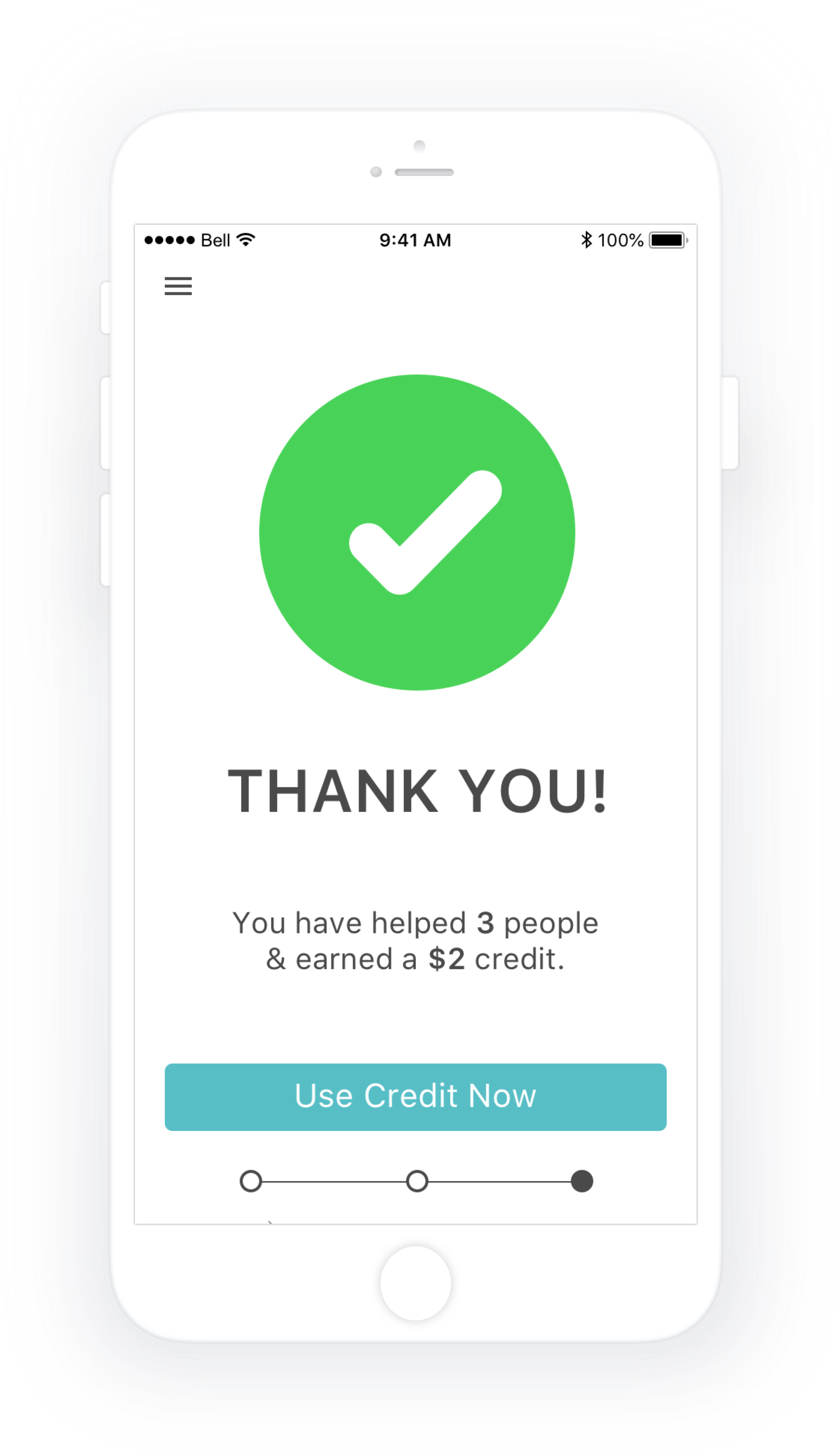
Provide consumers with an easy way to scan grocery receipts, receive notifications when food is about to expire, and schedule free food donation pick-ups. Additionally, users receive a small cumulative cash voucher which can be redeemed at partner stores, and are shown how many people they have helped through donating. Donated food can then be funnelled back into food banks, and a much needed national lunch program for Canadian school kids.
Key User Testing Insights
User testing was conducted with grayscale wireframes for 1 round, and in a hi-fidelity prototype for 1 round, for a total of 2 rounds.
The freshness meter was a point of confusion, and users were unclear whether this is showing food quantity, things you’ve donated in the past, or how close the product is to expiry
Selecting items, address, date, it was unclear to testers how/whether this needed to be done
Home and office icons were ambiguous and users were unsure as to whether they are home/office, house/apartment, or individual/group donation
Instead of using the screen expander everyone scrolled instead
There’s a lot going on on the first screen, users were not sure where to start
A majority of users wanted to see donation history
Testers were excited about receiving credits, and some also liked being able to see the direct impact they had made in peoples lives
Next Steps
Testing different ways of communicating the freshness meter with labels and colors
Presenting less information on the first screen; separating it out into smaller steps
Refinement of app elements through user testing
Including the addition of the users donation history and a scroll feature in the grocery item listing
Integrating with other apps or tools such as a calendar, shopping list, etc., as well as a deep dive into the iOS Human Interface Guidelines and design patterns
